1. Introduction: The Power of Color in Interior Spaces
- Why Color Matters: Begin by explaining how color is more than just a visual element in design; it’s a tool that influences mood, energy levels, and behavior. Mention how color psychology has been studied in fields from marketing to therapy, and now it’s a valuable concept in interior design.
- Science of Color Perception: Briefly touch on how our brains perceive color and associate different colors with emotions and memories. This sets the stage for how powerful color can be when thoughtfully applied in home design.
2. Breaking Down the Basics of Color Psychology
- Warm Colors (Reds, Oranges, Yellows):
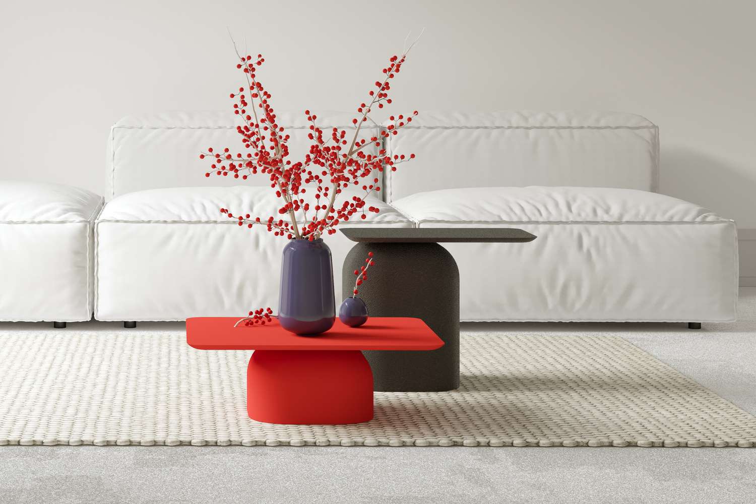
- Red: Known for its intensity and ability to evoke passion and energy. Ideal for social spaces like dining rooms or living rooms where conversation and liveliness are encouraged. However, it can be overstimulating in large amounts, so using it as an accent might be more balanced.
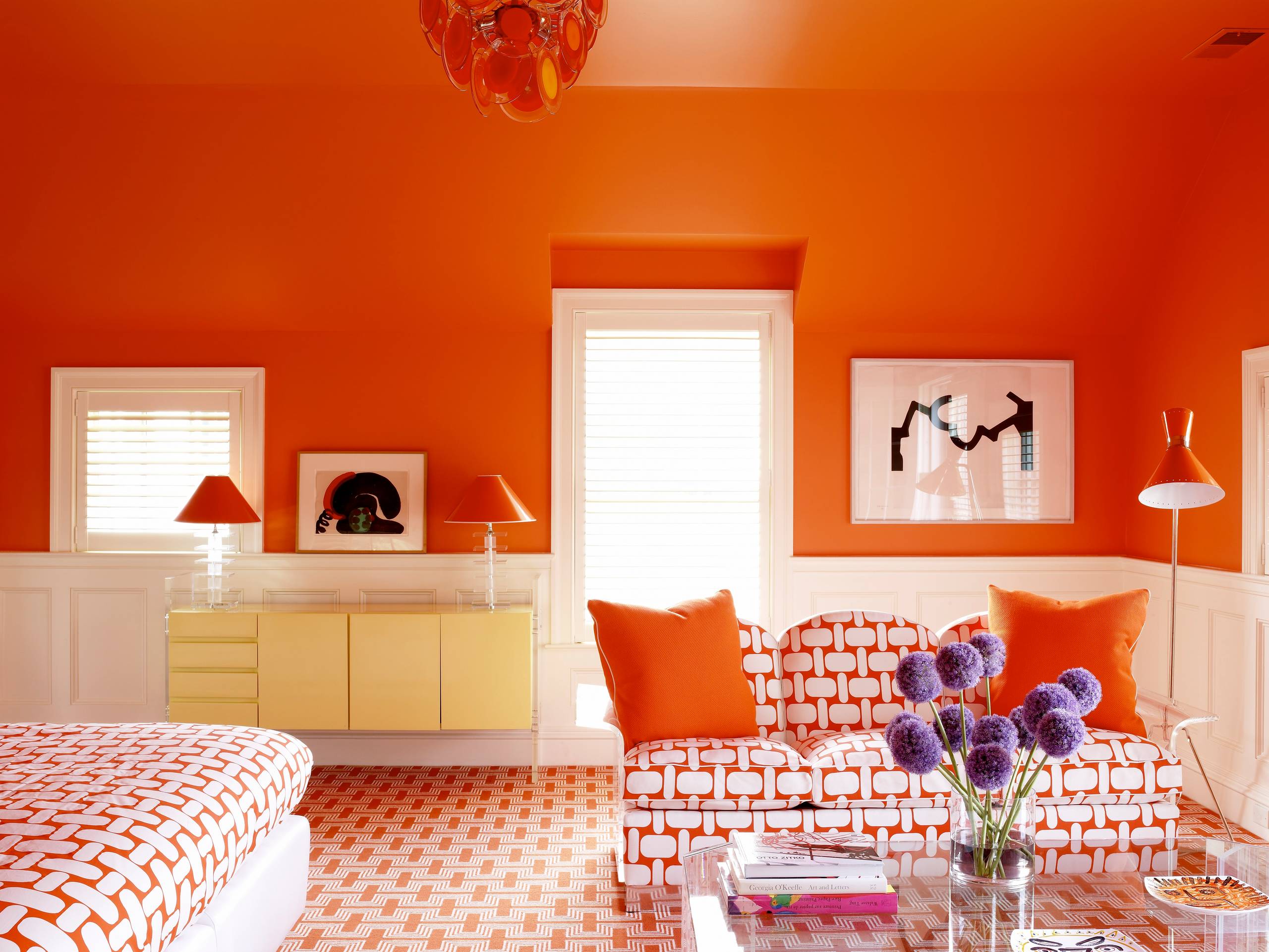
- Orange: Friendly and energetic, great for rooms where creativity and interaction are valued, such as home offices or playrooms. Orange can also be inviting in kitchens, as it’s thought to stimulate appetite.
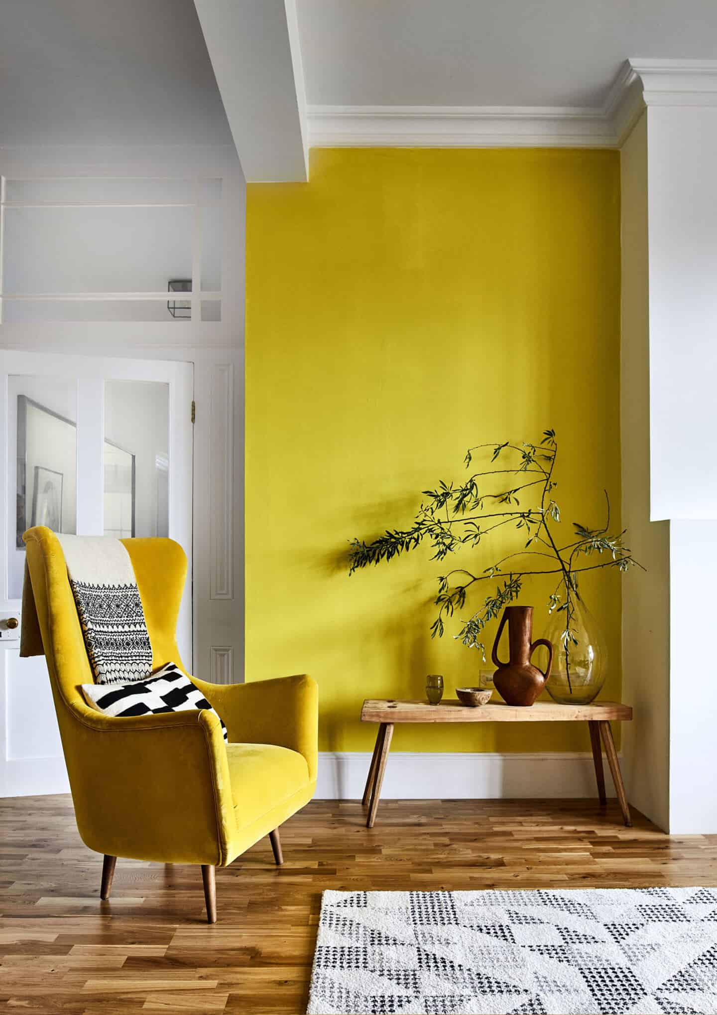
- Yellow: Associated with happiness, optimism, and warmth. Perfect for kitchens and breakfast nooks, where it can create a cheerful, energizing start to the day. It’s also a good choice for hallways and entryways as a welcoming color.
- Cool Colors (Blues, Greens, Purples):
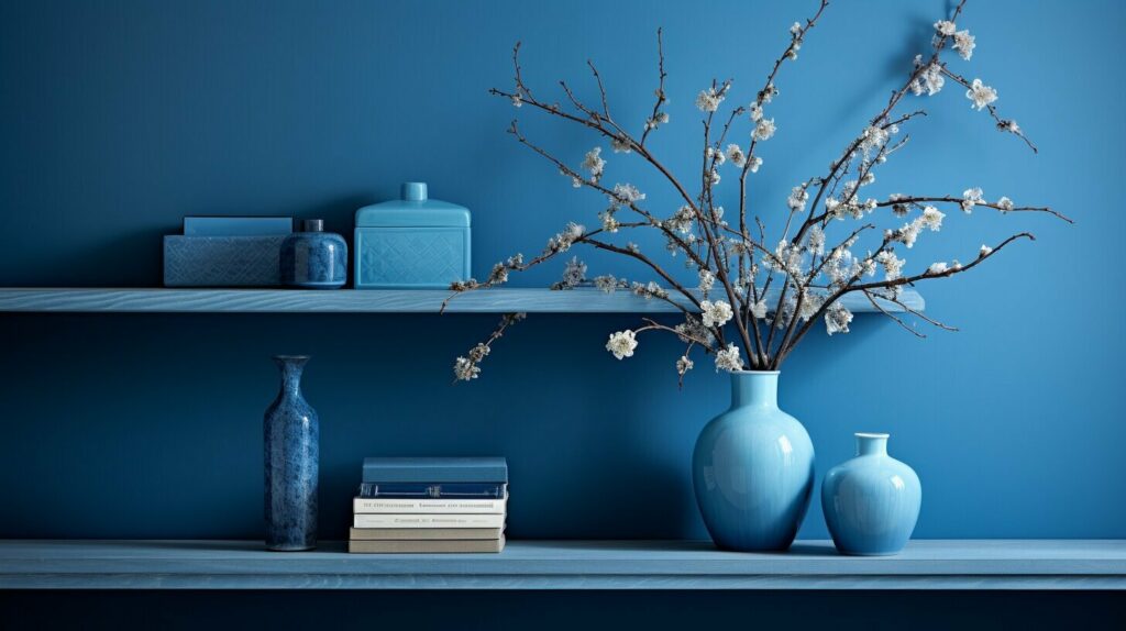
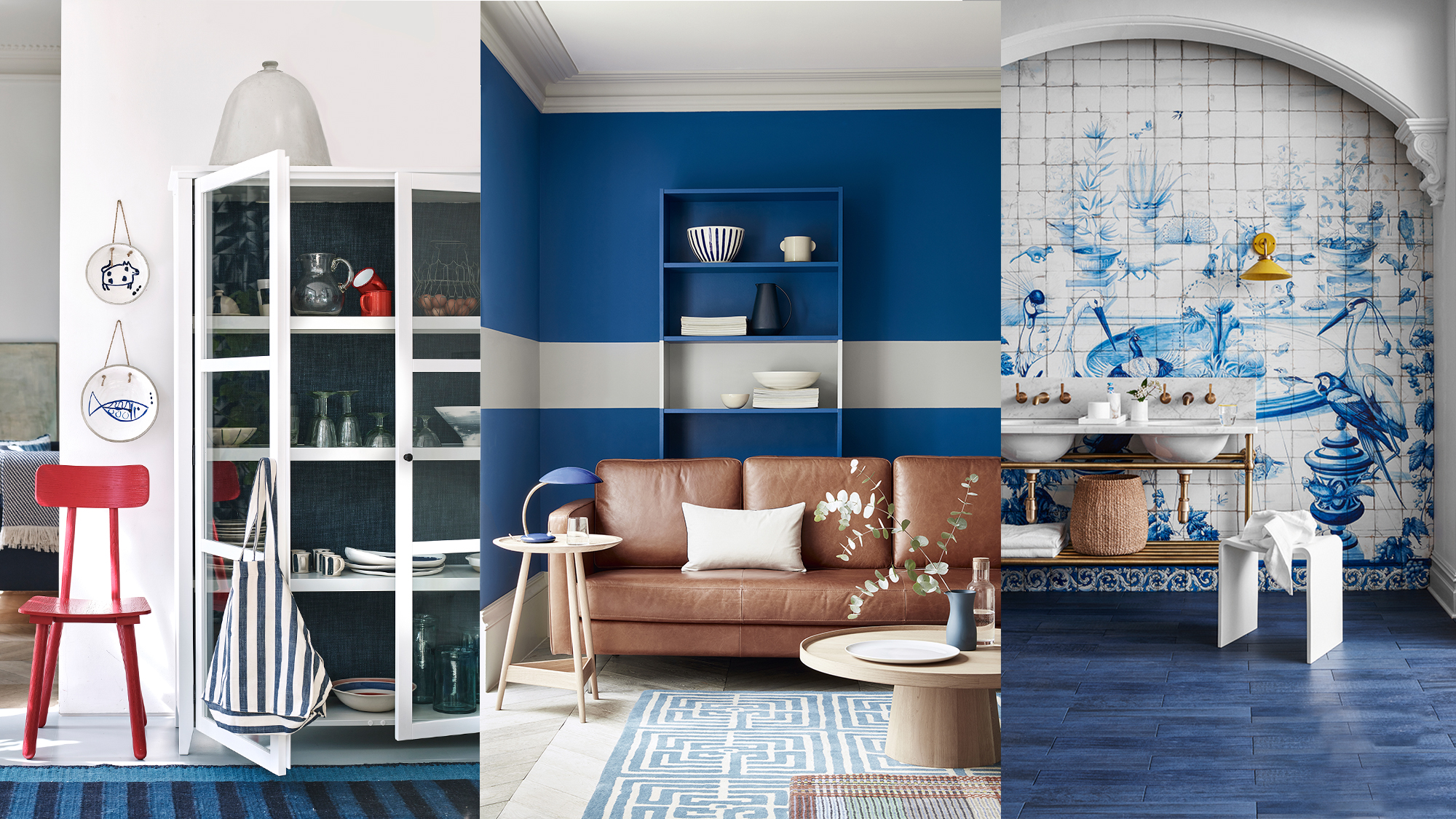
- Blue: Calm and soothing, often linked to feelings of tranquility. Blue works well in bedrooms and bathrooms, where relaxation is essential. Lighter blues can open up spaces and make them feel airy, while darker blues can add sophistication and intimacy.
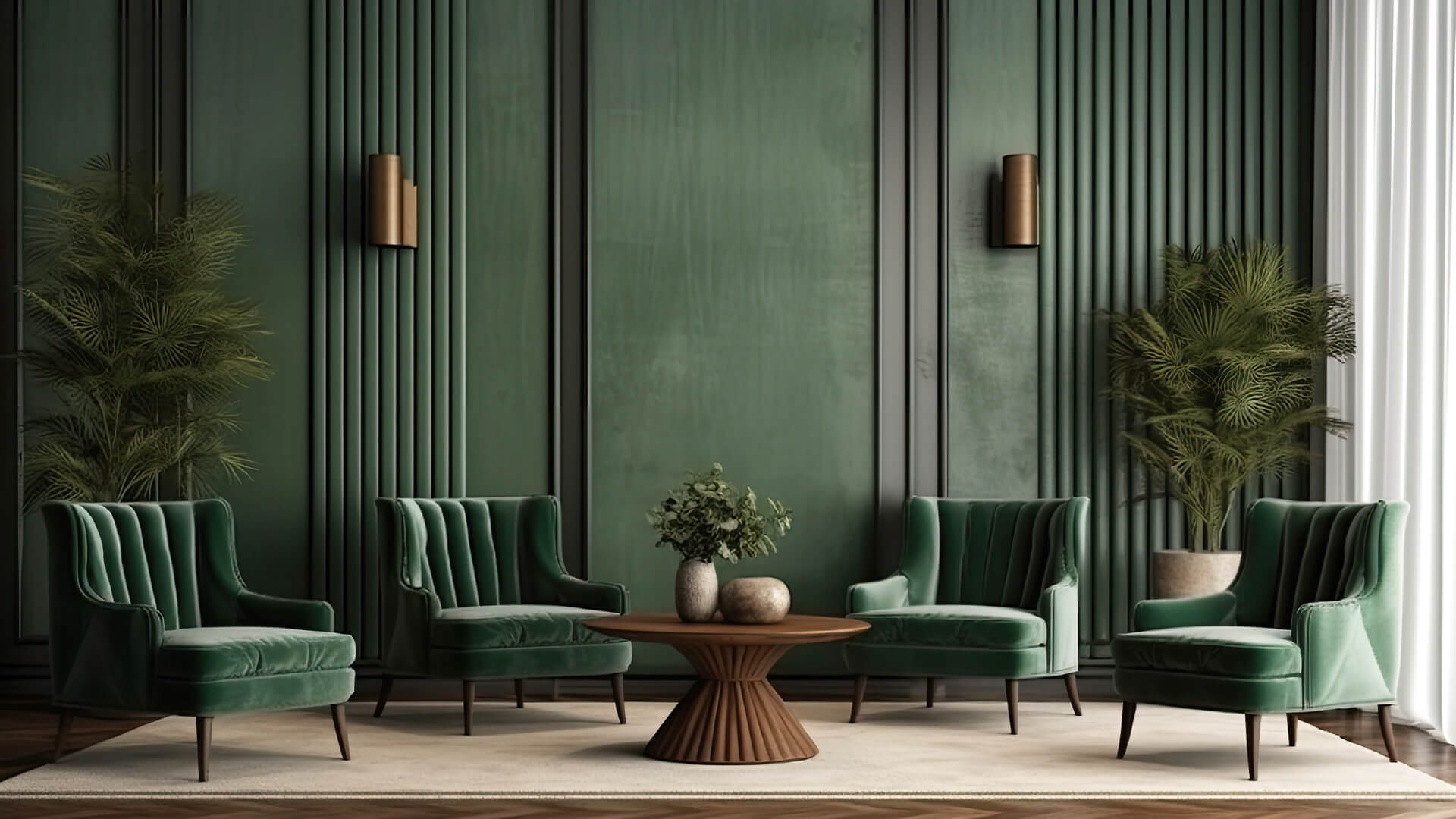
- Green: Known as a refreshing and natural color, green brings a sense of balance and calm. It’s ideal for living rooms, bedrooms, and any space where a grounding effect is desired. Green also symbolizes growth and renewal, making it suitable for areas where people want to feel rejuvenated.
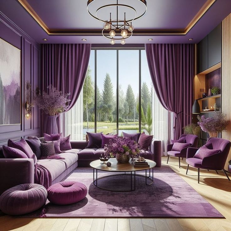
- Purple: Adds a sense of luxury and creativity. Lighter purples, like lavender, can be calming for bedrooms, while deeper shades can evoke a sense of sophistication and drama, making them great for accents in living rooms or home libraries.
- Neutral Colors (White, Gray, Beige):
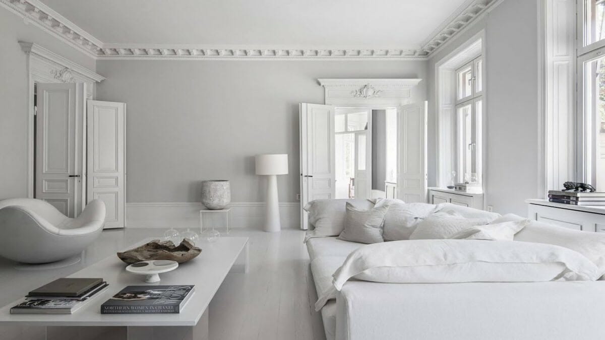
- White: Versatile and associated with cleanliness and simplicity. Great as a base in modern, minimalist, or Scandinavian designs, it allows other colors to pop and creates a sense of openness.
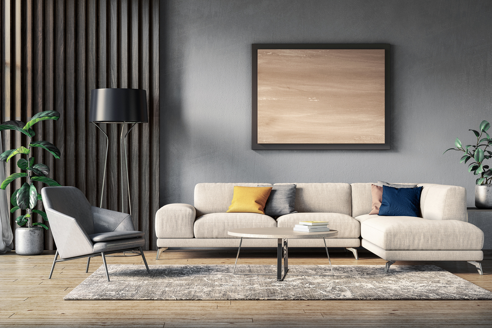
- Gray: Offers sophistication and calm without the sterility of white. It’s adaptable to both warm and cool tones, making it perfect for modern or transitional spaces.
- Beige/Taupe: Adds warmth without overpowering, creating a soft, comfortable atmosphere ideal for cozy living rooms and bedrooms.
3. Choosing Colors for Each Room Based on Desired Mood and Function
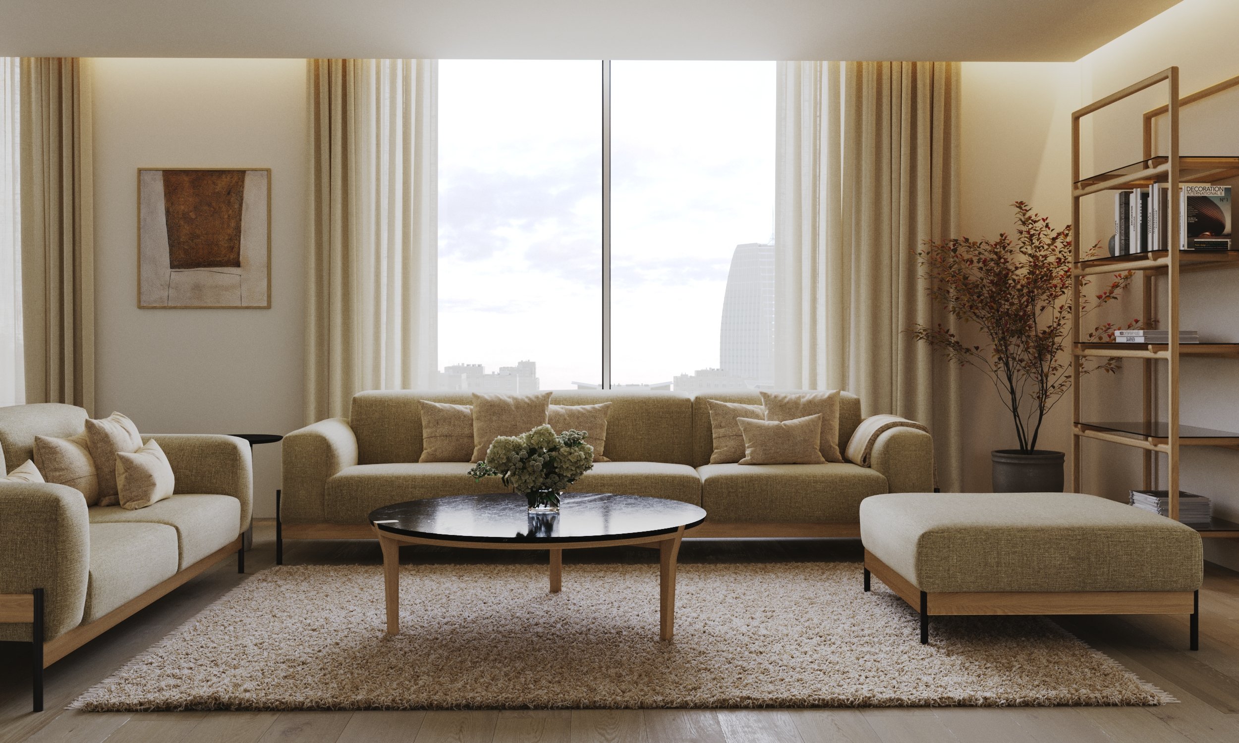
- Living Room: Discuss how warm colors like soft yellows or oranges can enhance social interaction and warmth, while greens and blues can create a relaxing, inviting vibe. Mention that neutral tones (like beige and gray) are a great backdrop, allowing accent colors to add character.
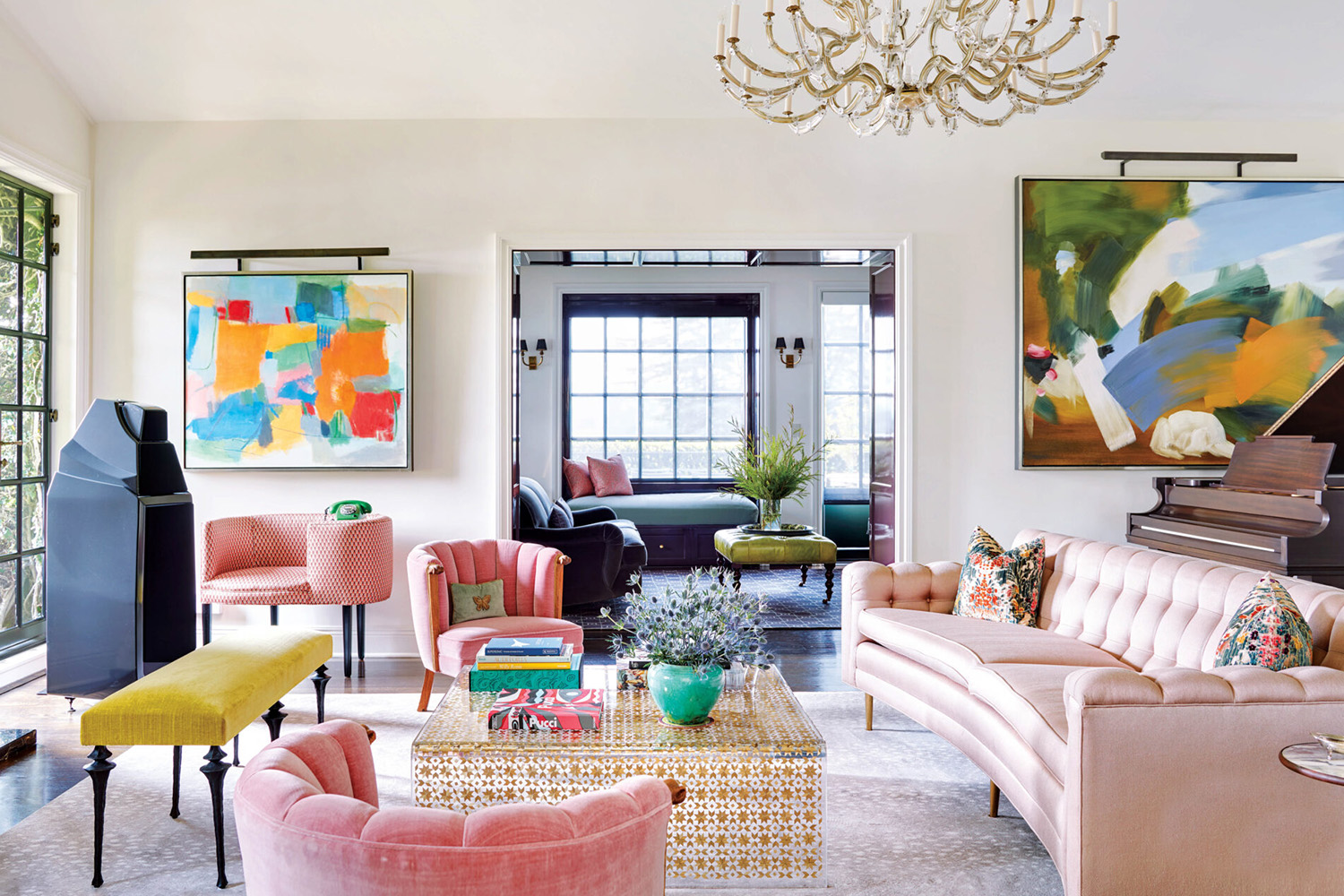
- Bedroom: Explore how cool tones (like blues and greens) encourage relaxation, which is essential for restful sleep. Muted shades or pastels work well here, while soft lighting can enhance the calming effect. Explain how touches of purple or pink can add a hint of romance or luxury.
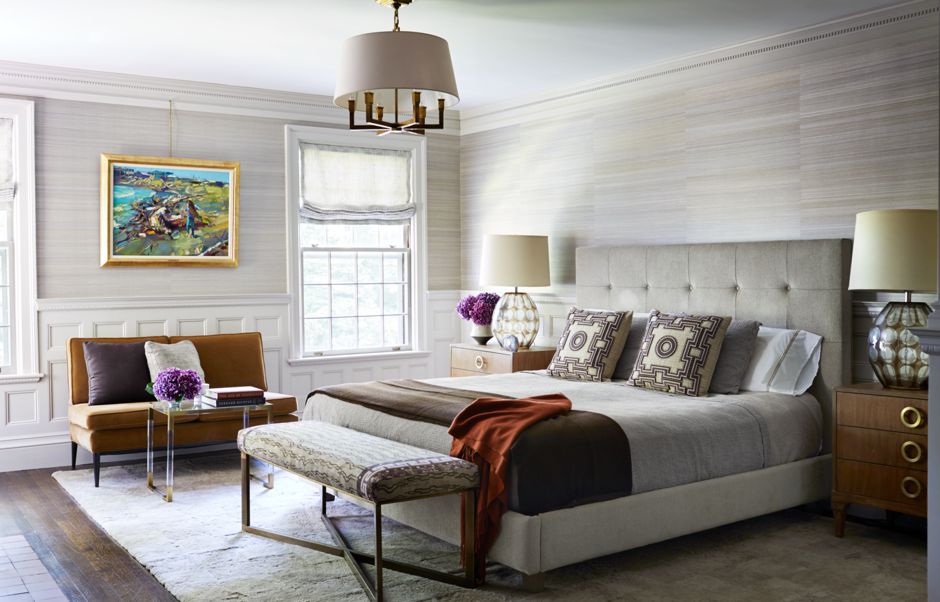
- Home Office: Offer advice on selecting colors that boost productivity. Blues and greens promote focus, while subtle oranges or yellows can stimulate creativity. Neutrals are also popular here, as they create a calm, distraction-free environment.

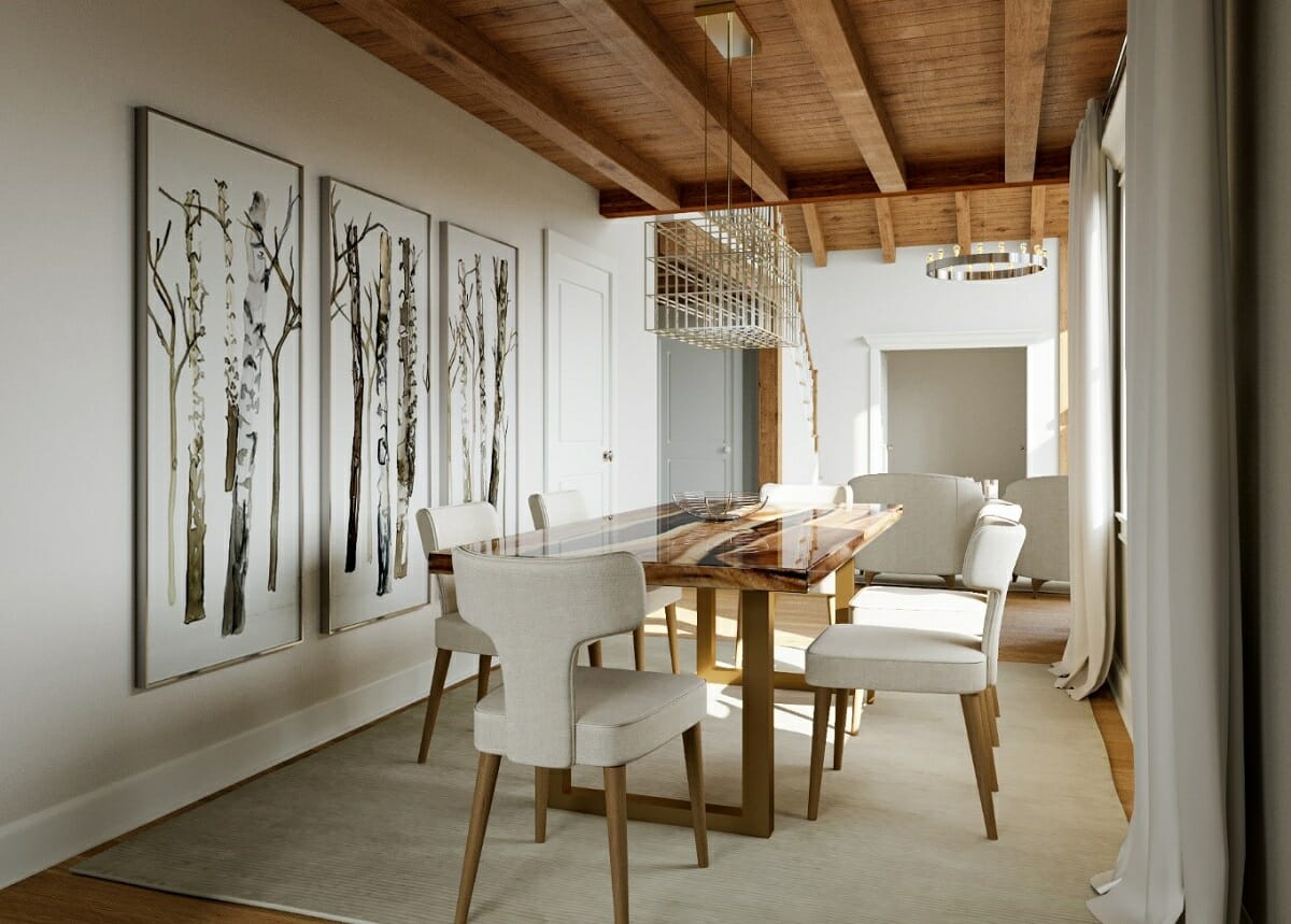
- Kitchen and Dining Room: Suggest colors that encourage appetite and create a warm, welcoming space. Shades like soft reds, oranges, and yellows are often used here. For a more modern look, neutrals like gray and white paired with natural materials (like wood or metal) can add elegance and balance.
4. Accent Colors for Depth and Personality
- Adding Bold Accents: Explain the concept of accent colors, suggesting that bold colors like red, teal, or mustard yellow can add personality without overwhelming. Use them sparingly on one wall, in furniture, or through accessories like pillows and art.
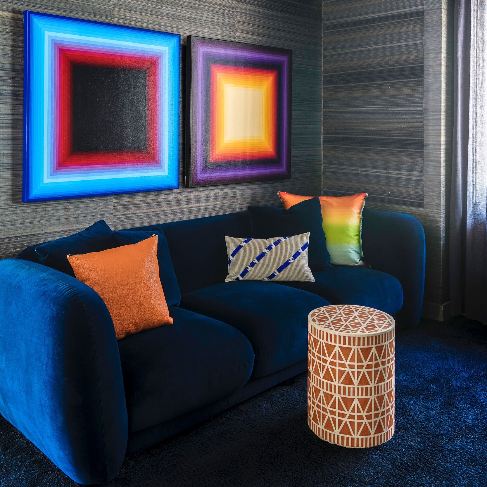
- Layering Colors for Depth: Discuss how layering colors can create depth in a room, such as combining different shades of the same color for a harmonious, sophisticated look. This works especially well with neutrals or cool tones like blues and greens.
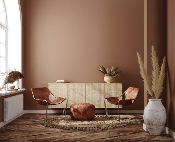
- Color Placement Tips: Share ideas on where to use accents effectively, like painting a feature wall, choosing standout upholstery, or using colored lighting for a dynamic effect at night.
5. Trends vs. Timeless Choices
- Understanding Color Trends: Introduce popular colors of the moment, like earth tones or muted pastels. Discuss how trends can refresh a space, but might feel dated over time.
- Timeless Palettes: Explain that timeless colors, such as neutrals or classic shades like navy or olive green, are less likely to go out of style. Suggest balancing trendy shades with timeless neutrals to create flexibility, so changing a few accents can update the room without a major overhaul.
6. Avoiding Common Color Mistakes
- Overusing Bold Colors: Warn against using too much of a strong color, which can feel overwhelming or distracting. Instead, suggest incorporating bold colors as accents or balancing them with neutrals.
- Ignoring Lighting’s Effect on Color: Explain that natural and artificial lighting can significantly alter how colors look in a room. Encourage testing samples under different lighting conditions to see how colors behave throughout the day.
- Not Considering Color Flow: Mention how clashing colors from room to room can create visual discord. A harmonious flow from one room to another makes a home feel cohesive; suggest color schemes that transition smoothly.
7. Conclusion: Harnessing the Power of Color in Your Own Space
- Bringing It All Together: Summarize how using color purposefully can transform not only the look but also the feel of a space. Emphasize that color choice is highly personal and should resonate with the moods, emotions, and functions the homeowner wants for each space.
- Encouragement to Experiment: Encourage readers to try new colors with small elements first and to observe how they feel before committing fully. Suggest they focus on how the colors make them feel, rather than just following trends or rules.


